
Designing a billboard ad is not about filling space. It is about creating a message that people can understand, remember, and act on in only a few seconds. For businesses in Edmonton and across Alberta, mastering this skill can make the difference between a billboard that blends into the background and a billboard that drives real results.
Whether you are creating artwork for the first time or refreshing an existing design, here is a clear, step by step guide to building the perfect billboard ad.
Start With a Clear Message
The strongest billboard ads begin with one simple question: what is the most important thing you want people to know?
Drivers in Alberta have only a moment to take in your message. That means your billboard should communicate a single idea with absolute clarity. Avoid trying to say everything at once. Focus on what matters most.
For example:
- A headline
- Your main offer
- A simple call to action
If it takes more than a few seconds to read, it will not work on the road.
Keep the Layout Clean and Balanced
A billboard is not a poster or a brochure. The layout must be simple and organized so the eye knows where to look.
Effective layouts use:
- Clear visual hierarchy
- Large text placed toward the top or center
- Clean spacing to avoid clutter
- One focal point, not several competing elements
When your layout is clean, your message becomes stronger.
Use Bold, Legible Typography
Fonts matter more on billboards than almost any other medium. Drivers need to read your message from a distance and at highway speeds.
For Edmonton billboard advertising, the best typography choices are:
- Bold, sans serif fonts
- Large letter sizes
- High contrast between text and background
- Short line lengths for quick readability
Avoid script fonts or thin lettering. They disappear on digital screens and are difficult to read during a fast moving commute.
Choose Colors That Stand Out
Color psychology plays a huge role in outdoor advertising. Bright, high contrast colors catch the eye and are more effective on Alberta roads where sunlight, weather, and long sightlines impact visibility.
Tips for choosing billboard colors:
- Use strong contrast, such as light text on dark backgrounds or dark text on light backgrounds
- Choose colors that reflect your brand but still stand out
- Avoid heavily detailed gradients that disappear at a distance
- Use bright accents sparingly to draw attention
Strong color combinations help your message pop, even on a snowy Alberta morning or a bright Edmonton summer afternoon.
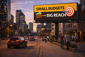
Use Simple, High Impact Imagery
Images on billboards need to be instantly recognizable. Complicated visuals or small details will not translate well at long distances.
Choose imagery that:
- Supports your message
- Is easy to identify
- Has bold shapes and clean lines
- Looks sharp on large screens
Remember, the image is there to enhance your message, not to compete with it.
Keep Words to a Minimum
The ideal billboard uses six to eight words. Anything more becomes difficult to read quickly.
For digital billboard advertising in Alberta, the most effective messaging includes:
- A short headline
- A clear offer
- A simple website or call to action
People do not have time to read long sentences while driving. Keep your words sharp, simple, and purposeful.
How to Submit Artwork to Impact Billboards
To make sure your ad displays perfectly on our digital network, here are a few guidelines for submitting creative to Impact Billboards:
- File Format
Provide artwork as a high resolution PNG or JPEG. - Correct Dimensions
Use the exact pixel dimensions we supply for the board you are booking. Each location may vary. - Safe Area
Keep all essential elements away from the outer edges of the artwork so nothing gets cropped. - High Contrast and Readability
Test your design at a small size. If you cannot read it when it is tiny, drivers will not read it on the highway. - Final Review
Send your artwork early so our team can give feedback or suggest improvements before it goes live.
These steps help your ad look clean, professional, and effective on every board in our Edmonton and Alberta network.
The Bottom Line
The perfect billboard ad is simple, bold, and designed for instant understanding. By focusing on layout, color, typography, and message clarity, your brand can stand out across Alberta highways and make a lasting impression on commuters.
At Impact Billboards, we work directly with Edmonton and Alberta businesses to build strong, effective creative. Because we are a local company, we take the time to review your artwork, offer design feedback, and help you optimize every element so it performs at its best on our digital billboards.
Ready to create the perfect billboard ad for your next campaign? Contact Impact Billboards today and let our local team help you design artwork that gets noticed and delivers real results.