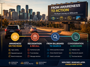
Not all ads are created equal. Some work, some flop, and some make you wonder how they
ever made it past the first draft. The difference usually comes down to one thing: clarity.
When it comes to billboard advertising in Edmonton and across Alberta, creativity isn’t about
squeezing in the most information. It’s about saying the most with the least. Drivers only have
seconds to see, read, and remember your message. That’s why smart design is what separates
a passing glance from a lasting impression.
At Impact Billboards, we see this every day. The best billboard campaigns are simple, direct,
and impossible to ignore.
The Three-Second Rule
Billboard designers live by a simple rule: if you can’t read it in three seconds, neither can the
driver.
Traffic moves fast, and so does attention. A billboard needs to deliver its message instantly, with
no fine print, no clutter, and no confusion. The best billboard ads grab the eye, communicate
one clear idea, and leave a lasting impression before a driver even passes the sign.
A great billboard is more like a headline than a paragraph. It’s short, bold, and to the point. You
want your audience to see it, understand it, and remember it, all within a few seconds.
In the world of digital billboard advertising, every word and every visual element matters. When
your ad is competing with the rhythm of traffic and the distractions of the road, clarity becomes
your most powerful creative tool.
Design That Demands Attention
Strong billboard design isn’t complicated. In fact, the most effective billboard ads often follow a
few simple principles that never go out of style:
– Bold fonts: Choose strong, legible typefaces that stand out from a distance.
– High contrast: Light text on dark backgrounds (or vice versa) keeps your message visible
in all lighting conditions.
– Minimal words: Six to eight words are often enough. A few well-chosen ones beat a wall
of text every time.
– Simple imagery: The image should support your message, not compete with it.
When these elements work together, your billboard doesn’t just look good, it works.
Whether it’s a new restaurant in Edmonton or a province-wide campaign across Alberta, great
billboard design follows the same principles: clarity, visibility, and memorability.
How Impact Helps Your Message Stand Out
Even the most confident marketer can use a second set of eyes when it comes to design. That’s
where Impact Billboards comes in.
We help businesses refine their creative so it performs as well as it looks. Sometimes that
means adjusting font sizes or color contrast for better readability. Other times, it’s simplifying a
headline so your message lands faster.
We know what works on a digital board and what doesn’t because we see it every day on
Edmonton’s busiest highways and Alberta’s most-traveled routes. Our boards are viewed by
hundreds of thousands of drivers weekly, and over time, we’ve learned what consistently draws
eyes and drives results.
The goal is always the same: maximize visibility and make every impression count.
Good billboard design is both art and science. It’s creative enough to stand out but structured
enough to communicate quickly. When clients work with us, they gain a local partner who
understands not just design, but the environment their message lives in.
Why Clarity Beats Complexity
In digital billboard advertising, the message that wins is the one that’s understood instantly.
Clever wordplay, witty taglines, and beautiful photography have their place, but only if they can
be understood at a glance.
Think of your billboard as a handshake, not a conversation. You’re introducing your brand, not
telling your entire story. A strong visual and a clear message create recognition, trust, and recall,
all within seconds.
One of the most common mistakes we see from advertisers is overloading a billboard with
information. Including a phone number, a website, a logo, a tagline, and three lines of copy
might seem necessary, but it usually just means nothing stands out.
Instead, focus on one core message. What do you want drivers to remember after they pass
your billboard? Keep that front and center.
For example, an Edmonton gym might use a simple, bold message: “Join Today. Train
Tomorrow.” A law firm could feature one clear benefit: “Injured? Get the help you deserve.” The
design doesn’t need to explain everything; it just needs to spark awareness and action.
From Design to Results
Strong creative is only the beginning. The real measure of a billboard’s success is whether it
drives recognition and results for your business.
At Impact Billboards, we work directly with local businesses to ensure their creative is optimized
not just for design, but for real-world performance. That means considering traffic flow, time of
day, and sightlines along Edmonton’s major routes like the Queen Elizabeth II Highway.
We’ve seen firsthand how a clear, well-designed digital billboard can transform a brand’s
visibility. When your creative works, people notice, and when people notice, your business
grows.
The Bottom Line
Great billboard creative is simple, bold, and unmistakable. Drivers have only a few seconds to
take in what you’re saying, so make those seconds count.
If you can’t read it in three seconds, neither can the driver.
Billboard advertising in Edmonton and Alberta works best when design and strategy align.
Clarity, contrast, and concise messaging turn a passing glance into a lasting impression.
At Impact Billboards, we help Alberta businesses turn smart design into real-world visibility.
Because when your message pops, so does your business.


